
The Case for Cream vs. White
White has always been a design staple, but cream has been making a pretty convincing case for joining the conversation. It has the same versatility that makes white so timeless, while bringing a little more warmth, depth and softness to the table.

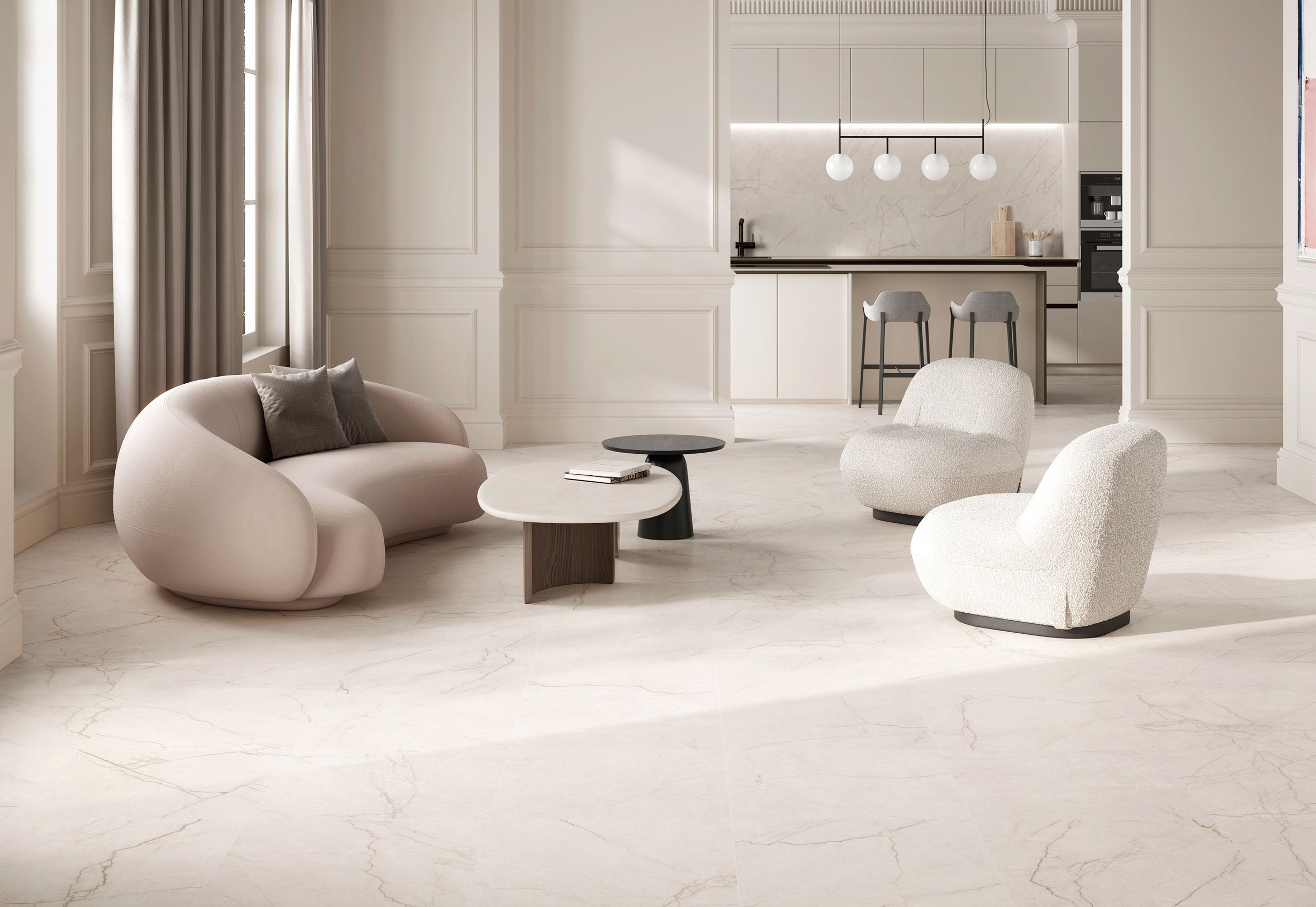
Cream is softer and warmer, adding a little more depth while still staying within the neutral zone. It can warm up an overall look while keeping things simple and light. Take lighting, for example. LED lights are bright and luminescent, while a warmer light can completely change the feeling of a space, making it feel cozier and more ambient. Cream works in much the same way. It doesn’t completely change the palette; it just changes the way everything around it feels.

White can come across as crisp and bright when paired with other materials, while cream softens the transition between colour, texture and finishes. Think of white linen paired with warm leather. The contrast feels more defined, while cream softens the combination and lets the different textures work together more naturally.

Cream’s natural warmth also makes it easy to pair with a wide range of materials, from wood and stone to marble and warmer metals. Think creamy tile alongside natural wood or a warm-toned stone. The similar undertones allow each material to complement the next rather than compete for attention. Where white can create contrast, cream can create cohesion.
Cream doesn’t need to make a statement to have an impact. That might be its strongest argument.
White is still a classic, and it always will be. The case isn’t that cream is better. It’s that cream deserves a seat at the table too.